Showing posts with label Unit 1. Show all posts

Tuesday, 31 January 2012

Evaluation Of the Project.

In this project we had to create packaging and swing tags for a shop front. My shopfront was one that sold the games console that their company produced, in the same way that the apple store sells their own products. I came up with the idea when was thinking about my interest and the career that I would like to pursue when I thought that it would be good to do games shop. So I did a bit of research when I realised that shops that sell games don't sell their own products so they all have their own packaging that their company and designers have made. So my interests turned to forms of technology that are game related Like Playstation, Xbox and nintendo products when I thought none of these companies have actual shop fronts because they sell them online or to other retail chains. So I decided that my shop front would market my own gaming technology called the neon. I got idea for that name by looking at game advertisements and consoles and to give them more of a technological feel lights are used like bright blues and greens and reds and of course neon is a gas but its used in a type of light, but it also has a futuristic ring to it.
My ideas developed in a way that began quite natural as my initial logos were hand made and a spring of ideas evolved from dripping ink on a page. This gave me an idea creating a logo that looked like it was formed form the fluorescent liquid dripped out of a neon light. I then began search for other logos that used fluorescent lighting to give me other ideas when I stumbled across Tron, a film that was made about a retro game world. So this had an influence into the styling of my logo. The next stage was creating the surface design which was another idea that came from nothing. I was experiment by putting paper through different process like staining, drying and burning the edges until I was left with a piece of paper that looked disintegrated and worn and completely opposite to my logo when I thought that it would be interesting to see how the two complimented each other. This is also where I got the idea of highlighting the cracks and edges with fluorescent blue and made it look like current flowing through wires so the image contrasted it's self. With the swing tag I didn't want it to be exactly the same as the packaging so I decided to make it into a stencil of the logo but used the same surface design.
Steven Lisberger the creator of the Tron movie inspired my final out come because he created this world that is a game and now that technology is becoming more advanced immense game worlds are being created meaning games consoles are like a portal to those worlds so I wanted my designs to simulate breaking into them. 
I think that I have done well in the creating of my surface designs and the final product is to a satisfying quality, my favourite parts are the swing tags that I created, because I have done them to what I believe  is a high standard using nothing but my hands and the computer to design and make them. I believe that the packaging that I made could have been made better by making it brighter because it is quite dark and so dosen't have as strong of an impact when you look at it as i would have liked.

Over all I enjoyed the project because I got to work on an area that I may be interested in going into somewhere in the future but most off all being able to create something with your hands, retouch it on the computer and then put it together to create a product. If i had more time on this product I would have like to have produced varied packaging with a range of surface designs and net styles.

Friday, 20 January 2012

Final Packaging Net And Swing Tags

This was a mock-up of the final net where I printed it out to see if the measurements were correct, if my fastening mechanism worked and to see if the design it's self looked good when printed. There where some problems with the lengths of the sides and of the lid which I was able to change because i had done this run through. I also put a barcode on the side to make it look more authentic. (barcode)

This was a quick cut out that I did to test my idea for a swing tag, as I had decided that I wanted to do a stencil type design. Of course this is quite shoddy so I will do a refined and improved version and give it a background.

This is my finished piece showing the final net and two example of swing tags, the first has been matched to the surface design of my box packaging. I put the logo onto it and then cut it out to make a stencil. For the second I printed out the logo and cut out everything that wasn't blue leaving the logo as the swing tag. The stencil swing tag is my favourite because I enjoy making stencils and it is rare to find a swing tag that is one, but I also like the way that the cutting is made visible because of the dark background and the way that the blue cuts around it and appears to crack into it.

Wednesday, 4 January 2012

Packaging net and surface designs.

This is the design for a net that I have gone with it simple in design meaning that it will be easy to use. there is a fastening at the top in which a little flap folds down into a grove.
This is a surface design that I created by doodling using U.V pen and light and took a photo of. I had to change the contrast, light and hight light some of the areas because photographing in the dark was a challenge.

Here is an example of what it would look like on a net.

This surface design was created using strips of images from a magazine and sticking them together.

I created a repeating pattern in illustrator to fill a net with the image.

This is my favourite as it was created by: scrunching up a piece of paper dipping it in tea, drying it, burning it and finally dipping it in ink. I photographed the image and edited it in photoshop, highlighting the edges and cracks formed by the process in a neon blue. I also think that this is the most successful because it has undergone a lot of process and has used a variety of skills and I like how the combination of both hand made techniques and computer based one can produce an out comes that suits my needs.

This is the image placed onto a net.

This is a collection of my games that I arranged, photographed, and then edited on photoshop.

I then placed it onto a net.

This is a hand created surface design for my net. I printed out the and then doodled over it with the first things that came to my head. 

Here I have gone for a more retro design by first, drawing on my logos and then filling the rest of the net with coloured blocks that are pixels giving it a kind of tetris feel.
This is what my final net Will be. I have put my symbol and my logo on the front. I used repetition o my logo on the back and on the front, an elongated version.

Tuesday, 6 December 2011

Packaging examples


These are my packaging examples that I did in class to aid in the development process of my product packaging.

They show a variety of packaging shapes and fastenings that I could use on my packaging.


some of them are quite elaborate and so there for I am unlikely to use them but also because they are it would make them less ergonomical and there for harder to use for the people buying the product.


I like the example on the far left and would like to develop this idea for my final packaging. i think that the slanted design would sit well with my product; a games console and give a more modern feel to it. 

These are some example of shapes that could be interesting to consider when I am creating my final net. On the right is an example of a constructed gift bag net.


Tuesday, 22 November 2011

Logo development.

These are some logo ideas that I have created using the different tools in illustrator.


These are some initial developments into creating my final logo. As you can see there ins an evolution in the ideas. Beginning with one of the initial ideas from my initial experimentation starting at the top. on the next one I decided to clean it up a bit by taking the fluid style of a real neon light. Finally I searched for other logos that use neon lighting and and colours and I found the Tron logo and took inspiration form it as well as the Atari logo. I like the way they use bold fonts that stand out and their fluidity as the letters of the Atari logo are quite curved in places. I also liked how the letters of the Tron logo fit together to make them look like building blocks.


After a final addition of inverting the curve of the "N" so that it faces the other way, this is the logo that I have decided to go with. 

Here is a retouched and coloured version which i first edited in photoshop and then illustrator using the live trace and live paint bucket tools.

Here is another variation of my logo using graph paper and a cross stitch technique with a blue pen.

I also decided to create a symbol for my product using the "N" from my logo that I edited using photoshop. 

Again here I have used the live trace and paint bucket to colour the image.

Friday, 18 November 2011

Initial logo ideas

This shows a variety of techniques that I have used to create some initial ideas for my logo and to inspire me to experiment in the different ways to develop an interesting design. I have experimented with chalk, painting with my fingers using acrylic, pencil and colouring pencils, linking ideas together in a continuous brainstorm. using ink and tracing. In the bottom right corner, I traced the words black tie over the acrylic wile it was wet so that some of the paint would transfer and make some of the words stand out.

Wednesday, 16 November 2011

logo analysis.

The product that I am going to design a logo and create packaging for is going to be a games console so there for I have chosen to analyse three of the most popular games consoles and as games consoles  are beginning to become multi- use platforms, I will also be analyzing apple, who are leading lights mp3 and music technology industry.


Apple logoApple Products. This shows an array of apple products and on the left is an example of the iconic Apple logo.  Apple have chosen a symbol to be their logo and this is effective because it is easily recognizable by every one so even if you haven't  herd of Apple, then you could easily guess the name.

 PS3 logoPS3 ImagePS3 Packaging, PS3 Controller. Playstation on the other hand went for the type option where the standard logo is just that and numbers or model names are added on for new developments. The name is also abbreviated to the more commonly known PS, with titles such as the PS3, PSP and soon the PS Vita. I have also collected a selection of images featuring hardware, packaging and also an image of the console, with a game related, stylized background to entice possible customers. The packaging is simple and I think this is good because when advertising a product like this you want them to think that it is easy to use so that they will buy it. I like the surface design on the controller, it's a form of digital camouflage that is associate's  with the popular war game Call Of Duty.  as it is game related i will take it into account when designing my own surface designs.


X Box LogoX BoxX Box controllerX Box Packaging Again, the packaging is simple which seems to be common with successful gaming platforms. I like the way that the light pierces through the orb on the X Box logo to create the X, and the text is large in size so that it is easy to read, catches the attention of possible customers and is easy to remember which is key in the design of a logo.
Nintendo LogoNintendo Wii consoleWii PackagingWii fit. The Nintendo logo is simple in design but is one of the most profitable consoles in the world. The Wii fit shows an example of how the logo has been changed and adapted to increase the range of the market. I like the neon blue colour that is emitted from the disk drive and I would like to use this for my logo.

Tuesday, 1 November 2011

Creating and developing my Final poster.

These where some of my initial ideas for a poster. At the top are a few of  my initial ideas.  The First is  a variation of a quotation from a Lil Wayne song, the quotation is " Black and white diamonds" referring to people as being like diamonds. So I put we in front of it and wrote in a large block like font where you only see the outline of the letters except for the "A".
The second was  an attempt at creating a piece that visually represented the word. In this instance the word was illusion and tho there for the piece the style is suppose to represent smoke and give a disappearing effect. The colour that I used is soft as it helps with the idea of a fading effect.

This piece is another experimentation of the idea of visually representing the word, in this case the word is manipulation where some of the words are held by strings and entangled to represent the idea of manipulation.


Bellow is a similar in aim to the previous two but is a form of an advert, again using lyrics from a song; "ur a Jerk" referring to a dance move performed with the legs, hence why only the legs are seen.
This was the first stage in the development where,
 I simply drew a circle and wrote the  quotation in it  as an initial plan
 of where the writing was going to fit.

In this stage of the development I drew the face 
a little more accurately and wrote the words in a way
that made them start to take the shape of the facial features,
which was the aim of this calligram.


This is my final poster design which is a calligram of the quote " the only real enemy to have ever existed is an internal one"- page 1, line 1 from a book called the road to suicide. I first herd this quote while watching a film called Revolver which stared Jason Statham and it was about a man who was a master conman who had just come out prison and was dying of a terminal illness and was out trying to get revenge and battle his mind and emotions. the face that is formed by the calligram is a picture of him form the film. There where many good quotes in the film another of them being "the only way to get better is to face a better opponent" form a book called the fundaments of chess.
My calligram was first inspired by the work of Oscar Wilson who does a lot of work using calligrams. While searching hough images o calligrams i found one of Jimi Hendrix and liked the way that the letters where used to form his afro. I adopted this idea and then mix it with the theme o the quote and the style of the film. I first traced the pictures outline and filled the shape with words form the quote in a kind of sixties mixed with graffiti. I scanned the picture in and then edited it with photoshop. When I finished cleaning it up with photoshop, I then re-opend it with illustrator, live traced it an then coloured it using the live paint bucket. when I finished the colouring the colouring stage, I again opened it in photoshop and used the smudge tool to make the top part look more like hair and the jacket to give the calligram more of a presence. In illustrator I wrote the quote so that the audience know what the original quote was and where it can be found.


I chose to use the colour purple because it is dark and quite severe and serious and this compliments the quote. For the background of the quote I used a skin tone colour showing that it is a face and I used red for the lips making the facial features more defined.

Food typography.


Above is a mind map of different examples of typography created using food. This section will be focused on work inspired by Ed Rucha.


This is an example of of typography that I have done that was inspired by Ed Rucha and has been created in food. The words or phrases used are related to the food item it's self.
This example of typography was created using popcorn. I spelt out the phrase nom which is a reference used to relate to the idea of eating it or eating something quickly and enjoying it.

This piece was relatively simple in design but was quite difficult to create as it involved making a hand print with jam. This was tricky to do as it mainly stays on your hand when you try to make the hand print. The letting its self was done with a paint brush and by scooping and placing lumps of jam with my hands.
I created this using spaghetti that I boiled and then bent into the shape of the letters to form a word that can be related to it. In this case the word is stringy and I have made it so that the letters lead onto each other so it looks like it is all connected.

Here I have spelt the word orange using oranges. I formed each of the letters individually and then reassembled them in order to make the word. 

3D Alphabet

In this lesson we were tasked to create the alphabet using the object that were on the table in front of us.  These items consisted of waste plastic items, rubber bands e.t.c. The task was pretty simple once we got into it because you begin to see how the shapes of the objects are already similar to the parts of the letters, or can be manipulated to form them. We then photo graphed the them and put them on the computer to display.

This was just as separate example of how you can use your surroundings to create typography. In this example as you can clearly see I have written the word sand in sand.

Typography experiments


This is an example of experimental typography that I have done using adobe illustrator. Here I have experimented with different ways that you can change your type by altering the size, height, font, length, kerning (the space between two letters) and the character rotation. I have also experimented with typing on a path and typing within a shape. on the top right hand corner is an example of a clipping mask. 

To create this I first typed in Bob Marley's name and then found a picture of him. I then arranged it so that the type was on top of the picture. I highlighted both of the pictures and opened the object menu, selected clipping mask and then clicked mask so that the desired part of the  picture filled the lettering.

Typography techniques and Examples

Add caption
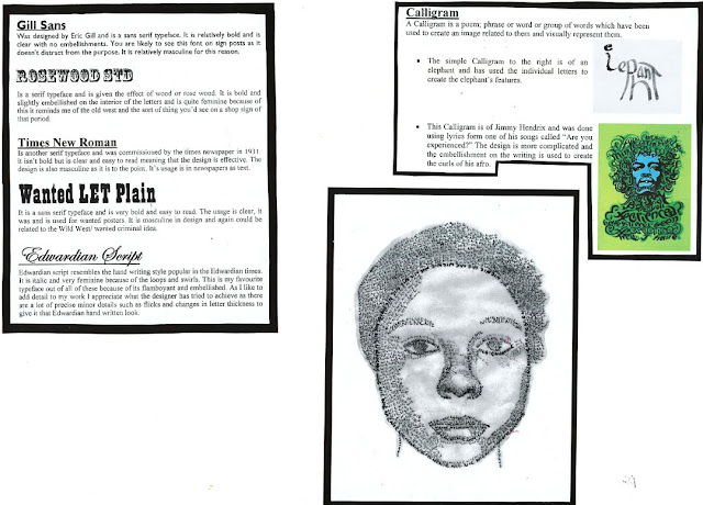
The calligram of the face above is one that I did myself of my own face. First I took a picture of my face and then lay tracing paper over the top, tracing the image using an abbreviation of my name (Nic). I pressed harder and softer on different parts to give a showing effect and there for make the image appear 3D.