Wednesday 12 September 2012

Vinyl re-design

As I re designed the sleeve I also decided to re design the vinyl. By accident I deleted some of the colour layers of the images I created and they became white and this gave me the idea to have plain white on red background with the simple composition above.

Vinyl sleeve re-design


I had to re design the vinyl sleeve, changing the coloring to red as the printing quality made it hard to distinguish between the grey of the gorilla and black background but the re colour also made the image brighter and complimented the insert., I also added leaves in the bottom left corner to fill the space.
These are the leaves I drew.
I scanned them into photo shop and highlighted the lines making them easier to live trace in illustrator.
Here i have coloured them in illustrator.
I kept the insert the same but i also added a aeroplane in the top left corner to fill the space but also gives it a king kong feel.
I drew the plane and live traced it but when  I placed it on the front cover i coloured it yellow to match the writing. 
I re coloured the back red as well.

Vinyl sleeve Net


The vinyl is in three parts, this forms the insert and the front cover.
This forms the other part of the insert and the back cover.
This part is a mock vinyl and the triangle part forms a pocket for the vinyl to sit in.
Link: Bar code to add authenticity. 

Link: Copy write logo again to add to authenticity.

I removed the black from the image because there where issues when printing, being difference in the shade of black coming out as dark grey.

Vinyl design

Link: To create the actual vinyl to insert into the sleeve I got an image of a blank vinyl so that i could put my design over the ring in the center.

I printed two sides to the vinyl so that I could stick both sides together and make the vinyl double sided.

Album artwork development (Ragga Jungle text)

I decided not to give my vinyl a specific title and just to put the name of the genre on the front cover as that would just sum up what the album was.
I coloured the writing with colours relative to the genre.

Again I used colours relative to the genre but just coloured each word separately.

Album artwork development (Immersed text)

I decided to add some writing on the inside of vinyl sleeve. I chose the word "Immersed" as the vinyl is a re print from an event I created which "took place" in the 90's.  
I used black, white and red because the red and white stand out well against the black.


I also tried to use green instead of white as it is relative to jungle music.

Album artwork development (Gorilla)

Link: When I think of jungle I think of the gorilla because it is a wile and powerful animal which is characteristic of jungle music. I wanted a picture that showed them being aggressive and showing their wild side.

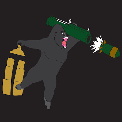
Link: Because the image above of the gorillas shows them fighting or at war with each other, in an attempt to anthropomorphisise the album artwork I will combine it with a human made weapon of war.   

This was what I drew.

Here I have put the image into photo shop and highlighted the lines of the picture and cleaned the image in order to see it better and in preparation for live tracing and coloring the image in illustrator. I also decided to add the building to relate to the urban roots of the genre of music.   

Here I began to colour the image.
This is the final image.

Vinyl net designs


These are the initial designs that I created that detail different ways that I could create nets for my CD packaging.


Album artwork mind map

I drew up another mind map to illustrate what would make good album artwork.

CD packaging mind map

I drew up this mind map to aid in the development of my CD packaging.

Red lion logo development


These are the two images that I am going to combine the lion of course isn't the edited version but I originally drew it there. At this stage I was trying to think of the best way to combine both of the pictures.
I decided to flip the lion so that it fit into the open part of the lettering and this would be a good place to start developing the logo into the final image. At the moment they look like two separate images but I want them to become one. I am going to develop the lions mane by extending the individual locks so that they entangle the lettering and move freely.
I re-drew the image in the way that I planned with the wild, freely moving locks of the lions mane. I drew them so that they looked like vines in a jungle and hence relating to the genre.
This is the final logo. When I finished drawing the image I scanned it into Photoshop to clean up the image and to make the lines darker so that when live tracing in illustrator there where no gaps between the lines and no problem when coloring. I chose red for the writing because it says red and when looking you already have that thought in your head. I used the same creamy, subtle yellow for the lion and a bolder yellow for the background as it makes the lion stand out more and brings it forward. For the cracks in between the lettering I used purple because it doesn't attract too much attention to the area and fits well with the red. 

Logo Development (Lion)


As the name of my record company is Red Lion the logo that I use to represent the label would serve its purpose better if it incorporated a picture of a lion in the design. Over all I would like to merge the lettering from the previous post with the image of a lion or the head of the lion in this case.


Link: When I was search for images of lions heads and images of already made posters and logos for jungle music, I found this and thought that it would be a good starting point for my design. 
As you can see I have done a line drawing of the image above to get the basic shape of the image and  to allow me to make further changes to the image and experiment with it. I will need to change parts of the image so that I don't plagiarize the work. I like the thick bold lines on the image as it makes the shape more prominent and look a lot stronger.
So here I have made some adjustment to the image in order to avoid plagiarism. The first thing that  I did  when redrawing the image was to invert it. I then altered the ear making it smaller in proportion and leaving out the inner detail. The next change was to the eye, I went for a leaner slit shape giving less of a scowling looking but more of a confident, empowered one. I change the shape of the facial indentation making the face more defined with stronger bone structure. Finally compressed the nose and elongated it in the vertical plane more, removed the whiskers and rounded the jaw making the mouth a silhouette. Al these changes draw more attention to the hair which moves freely and this is because I want incorporate the idea of mane  being a separate entity in further development of the logo.

Logo Development (RED)


I drew this in my initial ideas section when I was brainstorming ideas for a logo. I originally wanted to draw a calligram with the writing by fitting the letters into the shape of a vinyl, this is why it has a curved shape. I then made the outlines bolder by going over them with a fine liner and coloured the lettering red, to go with the word. Of course this was just an initial idea and I want to make some changes to the features of the of the characters, tidy them up and give them an more fuller, prominent shape.
Here I have "re-furbished" the image, Making the writing more circular and improving the shape. The letters are also more defined/prominent, I want this because stronger lettering captures the eyes better.    

Saturday 8 September 2012

Initial logo ideas


These are some initial experiments that I did in order to inspire my self in creating a logo for my project. Using basic drawing writing the name of the genre, characters and possible names. I experimented with shapes that suited to the genre  pictures associated as well as colours. I used a variation of techniques like oil pastels, pen , pencil , negative space, ink and water. My favourite is the writing at the bottom that says Jungle Bass. To create this image I used broken letters form of horizontal lines and then coloured over the image with red, yellow and green diagonally to this effect.


These are some quick images that i drew to brainstorm music on a whole, things that I would associate with it. There for I drew musical notation, musical instruments, headphones, musical technology like an mp3 player and a boom box, which illustrates how music has evolved over the last thirty years. Technology plays a big part in music, especially new genres of dance and electronic music. I also tried to illustrate sound in terms of giving out and receiving.


I scanned in this image that I created of the letter "J" of course being the first character of jungle in an attempt to make an icon that I could use as a logo. I edited it on photo shop to make the lines neater and bolder, I filled in the rightward facing sides of the J with black to create shadow and make the image 3D.


This is the same J from the image above but I decided to experiment with the image by colouring the white parts with colours associated with the genre. This has made the image a lot more vibrant and jump out at the viewer.


I tried a simple experiment using illustrator to create a letter mark style logo digitally with this mirror effect. I used varying gradients going left to right and top to bottom, relative colours and overall it has this clean professional look.
The image above was just some experiments trying to create shapes in illustrator, slicing them and creating wavy paths.

To further experiment with creating a logo I drew out ones that had already been created belonging to the genre as well as some of my own experiments with names of artist an songs. My favorite is the Jungle logo because of the way that it pops out of the screen. I took this image from the Ministry of Sound Jungle Classics album but changed a few parts and would like to incorporate the swirls that emerge from the letters into my work because of the way that they roam free and each appears to travel in its own direction. Freedom is a big part of Jungle music and dance music on a whole because it allows people to express them selves either throughout the music that they create or through dance itself. I also not want my images to look too modern because jungle was created in the 90s and to give more of an authentic feel my CD sleeve needs to look from around that time.

Here I wrote down some possible names that I thought sounded good to use for the record label that I am creating that is connected to the out come or "producing" the record. Red lion is most likely the name that I am going to go for because the lion is very representative of the genre. I have also played around with the layouts of the writing, different letter styles, some play on words and combinations like, re-verb written in the shape of a speaker and plants with brickwork pattern on them.