Wednesday 19 December 2012

Experiments


Using tutorials that I found on you tube as well as ideas of my own I began creating designs and concepts for ways that I could enhance my work.

This was a tutorial for a music poster (LINK), I took parts out that I didn't want and made the design more simple than the one in the tutorial which would allow me to then add more of my own ideas and make it different by possibly adding more hand made imagery. To achieve this I employed a multitude of techniques that I had never used before Like making my own brushes to create a pattern that I would then make 3D. Down to the more simple using basic shapes and changing the texture, pattern and fill.

This tutorial was a lot simpler than the previous one. It showed me how to create a grungy distressed look but just adjusting the gradients and using the brush tool.


This is my favorite text tutorial and it taught me how to create a sticker effect (LINK). The process its self is simple and quick because all I had to go was to make the out line bolder, cut off the top left hand corner and make it look like the back of  a sticker pealing off.


Tuesday 18 December 2012

Analysis, Blek le rat.

Xavier Prou AKA Blek le rat was one of the first graffiti artists in Paris and has been an inspiration to the British street artist commonly known as Banksy. He is known as the father of stencil graffiti, beginning his work in 1981 spray painting black rat stencils on the streets of Paris. This was a metaphor for the rat being the only free animal in the city. 

Link: This a picture of the Blek le rat's famous rat stencils and his trade mark or event tag as it is known in the graffiti world. As I said before the black rats are a symbol of freedom as they are left to roam the streets as they please. When I look at the colours, the red I cant help but see it as a symbol of dictatorial rule, communism, Nazi Germany's swastika which featured these three colours. Even though France is a democratic country as is the united kingdom there are times when we wonder if we have freedoms or if they allow us freedoms. Blek Has used a stenciling technique to apply his work to the streets, this gives a clean edge to the images but also allowed him to create a unique style when the common method would have been to spray paint straight onto the wall. This also form a practical point of the graffiti artist to quickly apply their work to a surface.
Link: This piece can be found on Leake street in London and is in a place called the tunnel, a legally permitted graffiti area which was created for the can festival organised by Banksy. This picture just uses black and white which doesn't draw attention away from the images and the message that they are trying to speak. To me that message is a possible representation of social standing in society. On the left we have a man in a smart suit carrying two cases full of what looks like papers or money illustrating the rich and the upper class. On the right there is a man sleeping on the floor who appears homeless at the lower end of the social ladder. Finally in the middle we have a sheep, a representation of the rest of society everyone in between. The sheep is usually a symbol of someone who does as they are told, follows orders, can't make up their mind and follows others. I think that he is suggesting that everyone in the middle are made to follow the orders of the rich and the people in charge. They have been created as a charade, an illusion as the face of while the rich get richer and the poor stay poor. 


Monday 17 December 2012

In depth analysis, Keith Haring.

Keith Allen Haring was an artist and social activist in the 1980s on wards who's work could be found in the streets of New York City and it explored concepts of birth, death, sex drug and war. Originally he studied commercial art but lost interest and moved into fine art. When he was 19 he moved to New York and was inspired by the graffiti and began studding at the school of visual arts in Manhattan. He received his first attention in the subways of the New York for his chalked drawings. His uniquely simple pop art style of using bold lines and vibrant colours appear childish at first but are the feature that  draw an audience, spreading strong messages of life and unity. I have began looking into his work because of his use of bold imagery and vibrant colours which i will try to incorporate into my work to capture my audience.

The Radiant Baby became known as his symbol when he started out in the early 80s. It has also been known by names such as the radiant christ. He describes the radiant baby as the purest and most positive experience of human existence. This piece is strongly linked to the his religious beleifs as the birth of christ is regard as miracle in itself, the idea of a child being born to bring salvation to the world. In my personal opinion I think that the purest idea from this belief is the idea that as a baby Christ didn't know what he was going to be, he was naive to the purpose of his birth at that point he was like every other child born and every other child like him. 


Link: Keith Haring Died on the 16th of February 1990 of aids related complications an in his honor, Madonna declared a benefit concert Where all of the ticket proceeds went to AIDS related charities. The Image above was from an album created by the charity and features Keith's work on the front in his characteristic style. The vibrant colours aid the dancing figures giving a feeling of life most likely what they are trying to inspire into HIV suffers as well as to others that your life isn't over just because you have it.
  

Sunday 16 December 2012

Mood Board


Pharaoh monkey: This is the picture in the top left hand corner. I found this picture on behanced while looking for graffiti style cartoon images and festival graffiti artwork. I like this picture because of the way it uses anthropomorphism, turning a monkey, often seen as cheeky and mischievous and into what appears to be a slightly arrogant/ self obsessed, image conscious, seventies style pharaoh. This would work well when I try to represent "Jungle music" in my work but in the sense that the music turns the humans into animals and not animals into humans. The use of bright, smooth glossy colours displayed here is continuous through the majority of dance music products and advertisements, because the install a "buzzing' feeling onto the viewer and bring the image to life as if it was moving until the moment you looked at it. This of course goes hand in hand with genres of high energy dance music.

(Blue) corse never die: I chose this image for similar reasons as the previous one, except my reasoning a far as the colour scheme, where I liked the artists use of variation in shades of blue to white.

Jungle juice logo: This is the picture second to the left from the top again i selected this picture for the use of an animal as the focal point of the picture, but also because of the vibrant yet minimalistic use of colour, which appears to have a sort of faded texture making it look more hand made or as if painted on a wall in a dilapidated area. This creates that rag tag, last minute feel that under ground  genres of music associate with.

Deadmau5: For the genres of music with a higher bpm I wanted to look for inspiring imagery which was a lot more colourful, vibrant and energetic.The Deadmau5  picture is such and to an extent where the the artist (with the mouse helmet) looks as if they want to stage dive out of the picture. I also believe the picture to be a good blend off human made and computer generated techniques as parts of the picture its self look hand painted (similar technique used) and then the image digitally enhanced. In order to explore a range of techniques I need to delve cad so that I have a broad range of ideas and developments and this will also give my work a more professional finish. 

Adventure time: Cartoony, childish, playful imagery adds to the idea of being immersed in the music in the same way that children are immersed and taken over by there imagination. The idea of the festival is to escape from the reality of life in the same way the cartoon adventure time is far from reality. I also want to incorporate the art style in to my work in creating posters that represent the music and using clearly defined primary colours that give a dreamy effect.House of Dub: This image was selected again because of the childish/cartoony image but also because it is an example of typical festival artwork similar to the one that I will be creating.
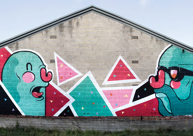
Mr penfold: Bottom left is similar in terms of the the colours and the curvy bubble like imagery, although it does use a mixture of simple shapes like triangles and others with basic edges the kind i would like to use in my outcomes. A deeper meaning that I personally find from elements in this piece or plainly from the use uncomplicated shapes is that "everything is as simple as it seems". The idea that in the world that the artist has created through bold defined line, minimal detail and use of four, paired, opposite colours bar tone, creates a calm, simplistic, relaxed environment. This goes hand in hand with the theme of the festival, letting go of every day life concentrating on your basic need and the music.

Keith haring black and white patterns: Keith Haring and his work as an artist was inspiring for many street artists from the late 80's on wards. He was a pioneer in the culture of socially active street art, raising awareness on issues that he believed to be important, ranging from war to sex to drugs. The use of minimal colours, minimal detail in regard to the images that he creates relates to the minimalistic style of music genres like dub and dubstep. The retro, monochrome pattern is quite easy to get lost in if you look at it for a while, relating to the the purpose/theme of the festival.

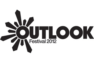
Outlook: Second from the left at the top, this is the logo for  music festival similar to and an inspiration for the  festival that I am creating. For this reason I thought it would be a good idea to analyse it for ideas in the creation of my festival logo. For the bold, basic type face that is used is easy to read, sun rays coming out of the letter "O" at the start of the name are most likely symbolic of the location along the cost of Croatia and the fact that it is a beach festival. It would  be a good  idea to use little details like this so that when people look at the logo they remember how the festival was for them or imagine what it would be like.  

Deep media music: This is a slip mat that is on sale from the Deep Medi music store. Deep Medi music is a record label that was created by Mala, a dubstep artist and it produces dubstep in a verity of styles some heavily  influenced by soul or jazz music, some by dub (sub-genre of reggae), and others the more raw electronic underground sound of the genre. I picked this as it is highly representative of the angle that I am trying to approach in terms of the artwork, use of an anthropomorphisised animal typical to a jungle environment, simple modest colours (focus on basic needs) and in the middle a massive sound system, representative of the sound system culture. Deep Medi Vol.2: This album was created by the Deep Medi record label a compilation of artists associated with them. The image on the front is in my view a picture form of the music that Mala creates, chilled and digital.

Defqon 1 poster: This poster is for a music festival that is in the electronic/ dance music genre but the atmosphere there is quite different to the one that I want to create for my festival. This is because is one for hardcore techno, trance and jump-style. Although there is still the idea of an escape from "civilization". I also think that there is a harmony in use of electronically enhanced imagery representing electronic music.

Thursday 6 December 2012

Mind Map

I crated a mind map to brainstorm ideas connected to my brief, expanding on materials, colour schemes festival promotion ideas and themes.

Monday 3 December 2012

Personal Project brief

This is my personal project breif.

Ideas Sheets


Bellow are three ideas sheets that I have filled out in order to brainstorm a variety of ideas and explore different possibilities of techniques, target markets, themes and outcomes that I could create.


This ideas sheet was focused on the idea of creating a shop front/ products owned by my record label in the previous project. Things like t-shirts and packaging. The obvious style of shop would be a record shop but of course it could be used for gig organised by the record label them selves to display new talent, artists and sample people reaction to new music. 

The Ministry of sound is a music production company swell as a popular night club, so, another idea was to create a club associated with the genre and the record label. If I engaged in this project I would create an event that was going to occur in the club and there for promote the event with posters, leaflets, design tickets, wrist bands, special offers, possible prizes and goodies to be given away on the night.

For my project I have decided to go for the festival brief because I personally think the theme is better and the idea of creating a music festival with multiple genres of music is more interesting this will also allow me to create a better range of outcomes with a variety of elements that I can derive from the different genres and incorporate into my work.