Showing posts with label A2. Show all posts

Monday, 29 April 2013

Evaluation of Prep

My journey began with the idea of a dark and twisted side to the alice in wonderland franchise. I was trying to find the sinister undertones that are present in the books and films, the idea of a young girl lost in a world that she had wished to be true, an escape that children often dream up and play in in their mind. Initially I thought of the idea that Alice was insane, locked in an asylum where she explored wonderland inside her mind. the world of wonderland and the characters from within it would appear to burst from her head as Alice looked on with menace on her face emphasising the idea that wonderland was normal to her, even though if you explain to someone about the world you vista in your head and described wonderland, they would thin you where a rambling mad person (that is how you would appear on the outside). This would make the viewer the in-between viewing what is inside from the outside and appreciating the world she conjured but understanding that it wasn't normal. Other ideas where to explore the "hippie" idea that Alice was on drugs, giant psychedelic mushrooms, opium and wild trips with strangers, living free and wild with all the cares of a child (none other than having fun). Exploring wonderland from a secondary point of view as if alice was taking you on her trip again putting you in-between by not being on a trip but experiencing hers. Another was the idea of the monsters that where created for wonderland, put the viewer in the place of alice and let them experience the fear that Alice would have felt when she came into contact with the jabberwocky or the bandersnatch. Though I realised that this was far off from my original brief which was to illustrate scenes from the book. I found one particular scene being the little crocodile poem
To find inspiration and guidance I looked to the original illustrator of the world, that being John Tinnel to make my on versions of his characters. As all of the illustration in the book where black and white I looked to modern illustrator. I wanted colour. I found Raphael Vicenzi. The vibrant explosive colours in his work where what I needed bring my illustrations to life.
Through the project some digital experiments which where a big help in the find of a composition of my final piece. I also looked into the defining features of characters, that being the face an looked into tutorials on how to draw things like lips and eyes as they are not my strong points.
In conclusion I was a little disappointed at the end of the exam as i wanted to do three illustrations and managed to finnish two because of my decision to do the little crocodile illustration as an A piece. This  do not regret as as the extra size allowed me to add more detail and rendering giving a more fuller picture. I liked the project but would have enjoyed it more if the brief was more flexible to let me develop my original ideas.

Monday, 15 April 2013

Digital experiments (illustration Brief).

I began to experiment with pictures using tutorials from the internet. All in completely different styles and representing different emotions, scenarios and a multitude of different layering, drawing and picture editing techniques done in Photoshop.
First off I explored a tutorial created to show how to make a digital collage, working in the style Miles Donovan using layering and blending techniques. The tutorial was very different to my outcome in the sense that it was a lot more regimented linear and was based on London. I on the other hand based mine on Alice in wonderland and tried to recreate a darker more overwhelming world with the focal point around Alice from the perspective that she had just arrived. I decided that the images of mushrooms that I obtained where too life like, plain and realistic, so decided to first off change the contrast of the background of the bottom image making it brighter, breaking away from reality. I used the blur tool to give a mirage/ hallucination effect. I did the same with the rest of the mushrooms I used to make them more vibrant. I crammed the images together to give the idea off being surround and emphasise the lost feeling that at Alice would have been experiencing. The dark colours give the idea of despair and being lost to the world. I placed the mad hatter looking down on her and the Cheshire cat above her shoulder to give the idea that they are tormenting her.

The second was a Chris Ede inspire illustration tutorial except instead of using a bird I chose to use a caterpillar to relate the piece to Alice in Wonderland. The caterpillar is blue and as Chris Ede uses varied shades of the same colour, I did the same using varied shades of blue. I used postures effects on the caterpillar to turn the shades into blocks of colour. I change the contrast an the lighting on the mushrooms to give more of a negative like effect as if they are getting brighter and eventually will turn bright white giving the piece a buzz about it. For the rest of the foliage  used roses poppies. The use of the poppies relates to the pipe the caterpillar smokes, most likely opium which comes from poppies and was a popular recreational drug but was also legal at the time sand so I began to make giant dense garden the surrounds the right hand side of the caterpillar. I used the selection tools to allow me to delete the shape of the flowers from other pictures. The other pictures were blue butterflies which allowed me to get caring textures of blue and shade on the picture and by layering and rotating the pictures and changing the fill and opacity it gives the "garden" some depth and makes it look like a a lot is going on in there. I then began to trace over the original pictures with the pencil tool so that I could obtain the details of the pictures. I then put the traces over the top to give the effect you now see. I made a copy of the rose trace and placed it on its own so there was no colour to fill the empty space, making it look as if fading into the mist of the dissolved background.

This tutorial that I followed taught me how to make a vintage collage poster using a few layering techniques and the pen tool. Originally it was for a flying woman but I decide to add a little humor an incorporate the vault boy from Fallout, a game based on a post apocalyptic world which occurred in the 50s. I put a nuclear explosion in the background and in the foreground wrote the words have a good day in the typical "perfect American white picket fence" style where there is an emphasis in remaining ignorant in the face of danger.

Sunday, 7 April 2013

Photographers Gallery trip

The photographers gallery is located on rambles street, around five to ten minutes from Oxford Circus tube station and is the largest public gallery dedicated to photography in London and it allows visitors to explore photography in all its forms. When we visit the exhibition the work of Laura Letinsky, Geraldo De Barros, Jan Svoboda's, Peggy Franck, Nicole Wermers', Batia Suter, Anna Parkina, Roy Arden, Clunie Reid.


Geraldo De Barros was a Brazilian painter, photographer and industrial designer and he is considered a pioneer of modern artist photography as well as for a generation of contemporary practitioners. Born is Sao Paulo in 1923 Geraldo first established himself as a painter and a founding member of the expressionist painting studio Grupo 15. In addition to painting he began experimenting with photography and in 1946 joined the Bandeirant photo club who aimed to rejuvenated photography by bringing it away from the realism in photos which come strait from the camera. Geraldo was influenced by Gestalt theory and the idea of an incomplete form in relation to the complete version. I could see this in his exhibition even though it was unintentional because he died before finishing a collection of work, the picture bellow is an example of one of those pieces.(Link)
This piece is in that unfinished style and is one of the last  in a series that he worked on. I think that the idea  of work intentionally being left unfinished expresses that the true art in in the preparation. The taking of the photo, the editing, developing and presenting of the piece. Using this picture as an example of that, the image looks as if the artist has posted a negative up on a wall to inspect the quality and details but also to compare against the other photographs they had taken.  They could all be of the same place, but on every occasions, one factor could be different meaning that every picture is unique. The Colours present to me the idea of a dream-scape. vibrant unnatural and out of this world. When I think of the significance of this in relation to the time period where there weren't computers with advanced programs like today Photoshop and illustrator and so most experiments would have been done by changing setting on the camera and by hand and most probably outcomes accidental adding o the art in journey idea. As he was elderly at the time he crated this image it would have been unintentional but the colours could be related to the prevalent underground electronic music and recreational drug culture. Psychedelically vibrant colours but also a lot of the music was created through experimentation and by accident.

Friday, 15 February 2013

John Tenniel in-depth analysis

Sir John Tenniel was a British illustrator, graphic humorist and cartoonist who's work was prominent in the later half of the 19th century in England. He is considered important in terms of the social, literary and history of art in that period. In 1893 he was knighted by Queen Victoria for his achievements in his field. Two of his most well known accomplishments are his work as the principle political cartoonist for England's Punch magazine (a weekly humor and satire magazine lasting from 1841 to 1992, drawing its name from the glove puppet act Punch and Judy) and later Lewis Carroll's Alice in wonderland and Alice through the looking glass.


This illustration is John Tenniel's interpretation of Davy Jones sitting on his locker. This image itself is dated to 1892 and shows Davy Jones reading a chart if the 1789 Ferrol harbour which was home to the HMS Howe which had run aground the same year. Davy Jones itself is an idiom for the bottom of or death at sea. The idea that when a person died there, their body would sink down into Davy Jones locker where it would remain. This satire illustration was making a joke of the incident by showing Davy jones looking for the ship on the map. 
Here is another example of the the work of John Tenniel. The piece was taken from Lewis Carroll's Alice in wonderland and shows the caterpillar smoking a pipe and talking to her as she peeps over the giant mushroom. When I look closer at the techniques that where used to apply the image, it appears    that initially pen an ink where used to draw the image because of the defined lines and the use of cross hatching. But of course this would be very in-efficient because thousands of copies would have been made. There for they would have created etchings and then put them into a print press.

 
In the sequel, Alice through the looking glass, Alice encounters the Jabberwocky. She first discovers the Jabberwocky in a poem in the back to front world of a looking glass. The Jabberwocky is a large reptile like creature, many features where drawn from dinosaurs, its scaled leathery skin and wings resembling those of a pterodactyl as well as its snake-like tale and claws with talons.


Thursday, 14 February 2013

Raphael Vicenzi in-depth analysis.

Raphael Vicenzi is a self taught illustrator who lives in Brussels, Belgium. His work is heavily influenced by the beauty and the fashion industry as well as street art and graffiti and into his mixed media style he incorporates soft and delicate lines with with some dark colours and strong outlines. He also uses mixed digital media, painting and water colours with textures to express his ideas and emotions.


(Link) Here are two typical pieces of Raphael Vicenzi work and two that I particularly like and find relevant to my idea for a final piece. They are a jam packed explosion of colour, imagery and typography where each part seems to be interlinked in the same way that the worlds that Alice explores on her adventures live and breathe as one. The bright colours are a true visual representation of a persons imagination, full of energy and of course Raphael's work is his imagination on paper. He does this by bundling what may seem like completely unrelated images like phones and birds in the picture on the left or in the picture on the right mushrooms and donkeys which on the surface doesn't make sense but in the head of the artist they do. In the same way that when we daydream, we too will have thoughts that to us make sense but to others don't and it is this concept I will take into account when developing my idea because the world that Lewis Carroll has many elements which appear insane but in his imagination may have been normal.


(Link) Wonderland and through the looking glass contain sinister undertones. Characters like the Queen of Hearts and the Mad-hatter especially, display schizophrenic and sociopathic behaviour. Alice, a child, is traveling through an unknown land with strange creatures, people and a warped, dreamscape eco-system are the sort of thing you may experience in a nightmare or the delusions of a mad person. For that reason I chose these images, the one on the right because it is of a young woman/ girl who is close to the common interpretation of what Alice looks like in terms of the body profile. Long hair, slim and elegant and confidant in posture. I took the picture on the left because the is similar the the idea of my composition. Alice in black and white and the world of wonderland in colour but appearing to break out from her head as if escaping her mind.

Thursday, 7 February 2013

illustration brief art in depth analysis.

Julia herself graduated from Kingston University in the U.K in 2007 with a BA in animation and illustration with her first major piece, her graduation piece receiving a lot of exposure on the internet and making its way to the front page of youtube as well as receiving one million his within the first two months. Since then she has gone on to complete an MA at the royal college of art and has been commissioned by clients such as E4, Skins, MTV, Virgin and Toyota.

      
This illustration is on a greetings card printed 6 by 4 inches and the image is of an elephant and a wild boar on horseback in the mountains. They are also satin coated to give better colour reproduction.  The artist who created the card is called Julia Pott and the piece is titled, "I love that you're here with me". Julia employs an amateurist style often referred to as awkward animations combined with anthropomorphises which she uses to explore the motivations between human relationships where by characters are represented by "mildly ridiculous animals". Although the style at first may appear childish, on closer inspection you can see the amount of detail that she has put into the hair of the animals and objects such as the log in the bottom right hand corner, the trunk of the elephant that is riding the horse as well as the trees in the background. This helps to create areas of visual texture where by the audience can tell by looking at the area what it feels like. Common to her work Julia uses predominantly muted colours with minimal vibrant ones helping to create a dreamy atmosphere and variation in tones which help the audience to focus on the key parts of the image. Where most artist would use thick bold lines to make parts of the image stand out Julia uses thin ones which helps to create this awkward style and the composition looks as if she meant the piece to appear like an instillation with each image standing in its own layer from front to back. I believe she did this because her work is meant to be personal, in effect she is creating what she feels inside, in her head from her experiences and the style is a representation of her personality. This layered effect to me illustrates the layers of our memories in combination with our feelings, each individual drawing stands on its own like each feeling is interdependent of another but to remember, we recollect specific parts of memories and feeling of the time and piece them together to recreate the scene in our head. Again I believe Julia uses her "almost" childish, awkward style to show how people become a "teenager" again when they are in love.
In comparison to the first piece which seems to be embracing a memory of two people who have feelings for each other, this seems to be more about regret. Initially I noticed the picture isn't as busy as the first, an almost barren land scape, dark and cloudy with lightning in the background. On viewing this picture you feel a sense of emptiness, minimal dull muted colours and the grainy texture used on the landscape create a tense atmosphere. The animals have been brought into the foreground and unlike the background the grainy texture wasn't applied so imidiate attention is brought to them instead. The same technique of "visual texture" has been applied to this piece through the fur of the animals, warm and fuzzy clearly showing that there is or at least were feelings of attraction between them. Their body language, lack of eye contact, hands in pockets and avoiding posture tell me that the relationship between them was at an early stage they maybe hadn't told each other how they felt and it was cut short. My understanding of the method behind the composition is that the animals visualy represent the moment and the background is a personification of what they felt at the time.
After looking at the work of Julia Pott, watching interviews and her animations I have defiantly concluded that she is a romantic, I have enjoyed exploring her style and her combination of texture and muted colours as well as her "awkward animations"  which are certainly a representation of her personality. She has defiantly taught me something about incorporating emotions into my work. As I will be creating an illustration themed by the "Alice" and "Wonderland" which incorporates feelings of needing to be connected and finding a way to fit in I will try to use similar techniques in order to bring the audience into the piece.

Thursday, 31 January 2013

Evaluation

My brief for this project was to create advertising and promotion for a festival that I had made up that was related to the record company I created in the previous project, "Red Lion". So to produce outcomes like wristbands, posters, t shirts and flyers. The main target audience was young adults aged 18 to 25 but this would also include people that where interested in the festival and the music that it supports. I came up with ideas for this by thinking about all of the events that are associated with music and what would allow me to produce the best type of outcome as well as give me room to explore possible different outcomes and the festival idea was the best.

Initially I started looking at the products that festivals and music companies related to the music genres produce, sell and use to advertise their events or business. I found a lot of the posters that are usually used to advertise the events are very computer generated and have a very digital feel to them, but because my festival is suppose to be about the bass music culture even though the music is electronically produced, the music has a very earthy feel to it because of the very deep warm feel that it has. Using a lot of computer generated imagery draws away form that vibe so I wanted to use more hand made techniques but as it is electronic music incorporate a digital/ modern element into it. After making that decision I started to look for festival artwork that had been created by festival goers, paintings on walls that expressed visually the music and the atmosphere of the festival.. These images re usually quite abstract and include anthropomorphism. I believe this is because they are trying to to say that when you listen to the music you become more in touch with your primal self , you lose all desire for material possessions and the need to impress others or care what they think about you. It's just you and the music. I found some work by one artist in particular called Mr Penfold, used simple designs mostly shapes and block colours put create a uniquely stylised cartoony image but in a way which can still be appreciated by a mature audience. This style relates well to the music which is minimalistic in terms of what he artist puts together when composing the music. Other artists that I looked at where keith harding and Blek Le Rat. Keith Haring being on the for front in the creation o the street art scene. I looked at and explored the work of Keith Haring and the deeper messages that his work contains to see f I myself could give a more deeper political meaning to my work. Blek Le Rat was the inspiration behind the style o medium  that i used to create my piece. I wanted to use the stencilling technique as this would give the hand made feel I wanted but  also an urban minimalistic feel. Blek Le Rat was a major inspiration for he British street artist Banksy. In previous projects I have analysed the works of Banksy in the past but this time I wanted to go back to the roots of where the style came form in the same way that some of the music of the festival is about relating with your origins. Blek Le rat is famous for his black rat which in effect is like his tag, but what I like most is the how the colours and the choice of surface he applies his work to look rundown and deprived but also earthy and full of life. This makes me think of Cuba in terms of the fact that when you look at the country, the towns and cities, it appears to have been paused form the 1950's on-wards  It has remained in that state while the rest of the world has been left to grow and develop because of the rules of communism that prevented them form doing anything and as such it is starting to crumble and fall apart, yet underneath all of that the music that they produce is full of life and the people are very into carnivals and enjoy partying.So to me Blek Le Rat's work brings life and growth to places that appear to be suppressing it. With this in mind I began creating my piece by doing sketches relating to the artists that I researched and the type of artwork, themes and vibe that I wanted to involve in the piece. For the creation of the emblem I wanted to incorporate the panda. The panda is quite a big and lazy animal and in comparison to the  music; dubstep, dub, reggae which all have slow deep baselines, the panda is the animal represents this the best. I used the anthropomorphism by putting headphones on it and so allows people to relate to it. To give an urban/ ghetto feel to this I put a gas mask on the face so that the image has a "fallout", back to square one look, but also because the mouthpiece of the gas mask look like the mouth and nose of the panda. When you are trying to send out a message, using lost of colours can distract from the purpose so I decided to use two, black and pink as his would make one of the colours look like they where popping out depending on how I arranged them. In the case of the lettering down the side the black stand out more on the paper version but on the spray painted version the pink on the emblem stands out more. As an experiment I tried using yellow and blue as they are primary colours and this allowed me to blend them at points to make green as well and was a good contrast from the black and pink. Spray painting onto the wall brought the image closer to the effect that I was trying to go for, the uneven surface gives more of a ware and tare feel because some areas where raised more than others and so they would have got more paint on them than the others. For further experimentation I took pictures of the wall piece and put it into Photoshop. This allowed me to play around with the hue, saturation, the contrast and the colours of the images as well as warp one of them. I selected one of the edited images and chopped it up separating the different parts and put them onto a template and designed a t shit. I then printed onto heat transfer paper and placed the designers one by one onto a plain white t shirt  using a heat press.

I think that the best part of my outcome was the wall piece because of the different effects that I managed to create. The parts that worked the best where the emblem and the get lettering because of the 3D effect that I managed to create. I also managed to cut out the stencils quite accurately and I believe I have greatly improved my stencil skills. I could improve my outcome by adding more to the pieces and fill the spaces. I could have planned better the imagery that I used so that every thing I created linked together better. I enjoyed the project as it allowed me to explore something that I have a great interest in through my art however in the future I would like to explore other styles of street art as well as forms of mixed media and incorporate more texture into my work.


Wednesday, 30 January 2013

Outcome

Once I had created my stencils and decided the order and the colours that I was going to use for the posters I began to apply them to A2 Card.
As you can see this is a more refined version of the first attempt. I adjusted the positioning of the pictures and  used  another stencil that I created so that the section down the right hand side would come out clearer. The only thing that I am disappointed with is that it doesn't have the smokey effect on the emblem that the first did, but it is a lot clearer and there are no smudges.

I experimented further by mixing blue and yellow spray paint, layering it, letting it dry and then spraying over it again. This as caused and interesting effect on the right hand side where by the detailed part is faint and the lettering bold which makes it appear to pop out. The "GET" lettering  also appears to be jumping out as the blue and the yellow have mixed to create green with small areas off blue emerging.
I decided to take my design further by stenciling onto a wall. I was particularly interested in what  the textured background would add to the picture or not and it has. Again I used pink but using black as the base layer has made it darker and and more gritty. To give a weathered ware and tare effect I sprayed in diagonal lines over the stencils and deliberately missed areas a concentrated more on others. Spraying pink on black has created a 3D effect which was exaggerated more by off setting the the stencils.


I decided to add some thing extra as this was the first time that I had spray painted onto a wall. Free hand, I sprayed the word "Ruffneck" changed to "RUFnEK", which is a common slang term used in jungle and reggae music, usually referring to a thuggish, rowdy individual. 
Here are some further developments that I have created using Photoshop by adjusting the hue, saturation and colour.


To further develop and explore the possibilities of my final piece I decided to to put my work onto a t-shirt using heat transferable paper. Using Photoshop I divided the picture up into three different parts so that I could spread it over the t-shirt and make the most of the space. The paper was A4 size so transferring the design onto the back was challenging but the divide was barely noticeable.  

Here is a student from my class modeling the t-shirt, showing each design that I put on it.


Creating my outcome

These are the initial stages that I went through when in creating the imagery for my poster and in trying to come up with ideas. This contains random drawings of pictures I have found and developments into my own images.


To help to brainstorm ideas and get a feel for the style of artwork that I will be using, I drew some of that pictures that I had previously obtained like some of the work of Keith haring, Blek le rat and Finn from adventure time. I drew the head of the ape from the Deep Medi music record label and the image second form the right as I will be using a cartoon art style initially to develop from. In the bottom right corner I tried to create a panda head emblem in the style of the deadmau5 head.

These images show the development of the emblem which will be a panda head that I will use on my poster. some of these images where inspired by others that I had seen like the right most two on the bottom row which where inspired by the ape from the Deep Medi music label. Others where random images of pandas in a street art style that I have made slight adaptations to so that tthey suit my purpose better.
This is the final version that I have decided to go for . The other images where for inspiration and I decided that I didn't want the image to be too cartoon like. Gas masks are quite a commonly used its in street art as they symbolise the idea of a rundown, hazardous, urban environment. Bellow is also a style of typography that I will use on my poster, with a fractured, distorted almost digital theme.
On this page I started to plan the dimensions of the type face that I was going to use that would run down the right hand side of the poster. I measured the side of the A2 sheet and created rectangles that decided the space I would use into eight sections, one section for each character. For this style I removed all of the curves only using straight lines. I introduced diagonal lines to that the design doesn't appear to rigid and vertical when the viewers eyes run down the page and spell out the word.
Because of the number of letters that the word contains they ha to be made smaller vertically to fit into the space and to keep the letters in proportion this also meant making them smaller horizontally leaving a lot of white space. To fix this I filled in the rest of the space with jagged broken shapes that fitted to the space that surrounded the lettering.

I wanted the lettering to be a different colour to the shapes that surrounded them this proved a difficult and painstakingly long task. As you can see in the  picture to the left, there are black splurges of paint from where I had to continually move and cover the surrounding shapes, paper and lettering to separate the colours. To eliminate this I sprayed the design onto another piece of A2 and the cut out the lettering so that I had as stencil for the lettering as well, then all I would have to do was line up the words after spraying on the first stencil and spray over those in black.
Here I have used the style that I documented earlier which say dub instead of get. This would then form the Phrase "Get Immersed"
This will be the emblem for the poster or the main image that will be associated with the event which is a panda wearing headphones and a gas mask.


This was a practice run through that I did to make sure that the images lined up and that the stencil would work but also to test any possible experiments an effects that could be created. For example the get lettering where I spray painted the pink first and then the black over the top to get a 3D effect. I also like the smokey effect on the emblem that I created as it gives a more hazardous, rougher look.

Wednesday, 19 December 2012

Experiments


Using tutorials that I found on you tube as well as ideas of my own I began creating designs and concepts for ways that I could enhance my work.

This was a tutorial for a music poster (LINK), I took parts out that I didn't want and made the design more simple than the one in the tutorial which would allow me to then add more of my own ideas and make it different by possibly adding more hand made imagery. To achieve this I employed a multitude of techniques that I had never used before Like making my own brushes to create a pattern that I would then make 3D. Down to the more simple using basic shapes and changing the texture, pattern and fill.

This tutorial was a lot simpler than the previous one. It showed me how to create a grungy distressed look but just adjusting the gradients and using the brush tool.


This is my favorite text tutorial and it taught me how to create a sticker effect (LINK). The process its self is simple and quick because all I had to go was to make the out line bolder, cut off the top left hand corner and make it look like the back of  a sticker pealing off.


Tuesday, 18 December 2012

Analysis, Blek le rat.

Xavier Prou AKA Blek le rat was one of the first graffiti artists in Paris and has been an inspiration to the British street artist commonly known as Banksy. He is known as the father of stencil graffiti, beginning his work in 1981 spray painting black rat stencils on the streets of Paris. This was a metaphor for the rat being the only free animal in the city. 

Link: This a picture of the Blek le rat's famous rat stencils and his trade mark or event tag as it is known in the graffiti world. As I said before the black rats are a symbol of freedom as they are left to roam the streets as they please. When I look at the colours, the red I cant help but see it as a symbol of dictatorial rule, communism, Nazi Germany's swastika which featured these three colours. Even though France is a democratic country as is the united kingdom there are times when we wonder if we have freedoms or if they allow us freedoms. Blek Has used a stenciling technique to apply his work to the streets, this gives a clean edge to the images but also allowed him to create a unique style when the common method would have been to spray paint straight onto the wall. This also form a practical point of the graffiti artist to quickly apply their work to a surface.
Link: This piece can be found on Leake street in London and is in a place called the tunnel, a legally permitted graffiti area which was created for the can festival organised by Banksy. This picture just uses black and white which doesn't draw attention away from the images and the message that they are trying to speak. To me that message is a possible representation of social standing in society. On the left we have a man in a smart suit carrying two cases full of what looks like papers or money illustrating the rich and the upper class. On the right there is a man sleeping on the floor who appears homeless at the lower end of the social ladder. Finally in the middle we have a sheep, a representation of the rest of society everyone in between. The sheep is usually a symbol of someone who does as they are told, follows orders, can't make up their mind and follows others. I think that he is suggesting that everyone in the middle are made to follow the orders of the rich and the people in charge. They have been created as a charade, an illusion as the face of while the rich get richer and the poor stay poor. 


Monday, 17 December 2012

In depth analysis, Keith Haring.

Keith Allen Haring was an artist and social activist in the 1980s on wards who's work could be found in the streets of New York City and it explored concepts of birth, death, sex drug and war. Originally he studied commercial art but lost interest and moved into fine art. When he was 19 he moved to New York and was inspired by the graffiti and began studding at the school of visual arts in Manhattan. He received his first attention in the subways of the New York for his chalked drawings. His uniquely simple pop art style of using bold lines and vibrant colours appear childish at first but are the feature that  draw an audience, spreading strong messages of life and unity. I have began looking into his work because of his use of bold imagery and vibrant colours which i will try to incorporate into my work to capture my audience.

The Radiant Baby became known as his symbol when he started out in the early 80s. It has also been known by names such as the radiant christ. He describes the radiant baby as the purest and most positive experience of human existence. This piece is strongly linked to the his religious beleifs as the birth of christ is regard as miracle in itself, the idea of a child being born to bring salvation to the world. In my personal opinion I think that the purest idea from this belief is the idea that as a baby Christ didn't know what he was going to be, he was naive to the purpose of his birth at that point he was like every other child born and every other child like him. 


Link: Keith Haring Died on the 16th of February 1990 of aids related complications an in his honor, Madonna declared a benefit concert Where all of the ticket proceeds went to AIDS related charities. The Image above was from an album created by the charity and features Keith's work on the front in his characteristic style. The vibrant colours aid the dancing figures giving a feeling of life most likely what they are trying to inspire into HIV suffers as well as to others that your life isn't over just because you have it.
  

Sunday, 16 December 2012

Mood Board


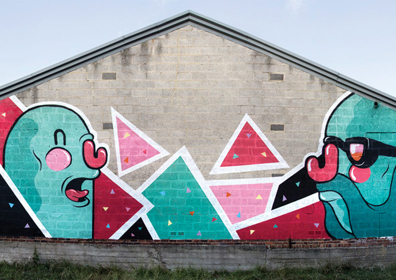
Pharaoh monkey: This is the picture in the top left hand corner. I found this picture on behanced while looking for graffiti style cartoon images and festival graffiti artwork. I like this picture because of the way it uses anthropomorphism, turning a monkey, often seen as cheeky and mischievous and into what appears to be a slightly arrogant/ self obsessed, image conscious, seventies style pharaoh. This would work well when I try to represent "Jungle music" in my work but in the sense that the music turns the humans into animals and not animals into humans. The use of bright, smooth glossy colours displayed here is continuous through the majority of dance music products and advertisements, because the install a "buzzing' feeling onto the viewer and bring the image to life as if it was moving until the moment you looked at it. This of course goes hand in hand with genres of high energy dance music.

(Blue) corse never die: I chose this image for similar reasons as the previous one, except my reasoning a far as the colour scheme, where I liked the artists use of variation in shades of blue to white.

Jungle juice logo: This is the picture second to the left from the top again i selected this picture for the use of an animal as the focal point of the picture, but also because of the vibrant yet minimalistic use of colour, which appears to have a sort of faded texture making it look more hand made or as if painted on a wall in a dilapidated area. This creates that rag tag, last minute feel that under ground  genres of music associate with.

Deadmau5: For the genres of music with a higher bpm I wanted to look for inspiring imagery which was a lot more colourful, vibrant and energetic.The Deadmau5  picture is such and to an extent where the the artist (with the mouse helmet) looks as if they want to stage dive out of the picture. I also believe the picture to be a good blend off human made and computer generated techniques as parts of the picture its self look hand painted (similar technique used) and then the image digitally enhanced. In order to explore a range of techniques I need to delve cad so that I have a broad range of ideas and developments and this will also give my work a more professional finish. 

Adventure time: Cartoony, childish, playful imagery adds to the idea of being immersed in the music in the same way that children are immersed and taken over by there imagination. The idea of the festival is to escape from the reality of life in the same way the cartoon adventure time is far from reality. I also want to incorporate the art style in to my work in creating posters that represent the music and using clearly defined primary colours that give a dreamy effect.House of Dub: This image was selected again because of the childish/cartoony image but also because it is an example of typical festival artwork similar to the one that I will be creating.Mr penfold: Bottom left is similar in terms of the the colours and the curvy bubble like imagery, although it does use a mixture of simple shapes like triangles and others with basic edges the kind i would like to use in my outcomes. A deeper meaning that I personally find from elements in this piece or plainly from the use uncomplicated shapes is that "everything is as simple as it seems". The idea that in the world that the artist has created through bold defined line, minimal detail and use of four, paired, opposite colours bar tone, creates a calm, simplistic, relaxed environment. This goes hand in hand with the theme of the festival, letting go of every day life concentrating on your basic need and the music.

Keith haring black and white patterns: Keith Haring and his work as an artist was inspiring for many street artists from the late 80's on wards. He was a pioneer in the culture of socially active street art, raising awareness on issues that he believed to be important, ranging from war to sex to drugs. The use of minimal colours, minimal detail in regard to the images that he creates relates to the minimalistic style of music genres like dub and dubstep. The retro, monochrome pattern is quite easy to get lost in if you look at it for a while, relating to the the purpose/theme of the festival.

Outlook: Second from the left at the top, this is the logo for  music festival similar to and an inspiration for the  festival that I am creating. For this reason I thought it would be a good idea to analyse it for ideas in the creation of my festival logo. For the bold, basic type face that is used is easy to read, sun rays coming out of the letter "O" at the start of the name are most likely symbolic of the location along the cost of Croatia and the fact that it is a beach festival. It would  be a good  idea to use little details like this so that when people look at the logo they remember how the festival was for them or imagine what it would be like.  

Deep media music: This is a slip mat that is on sale from the Deep Medi music store. Deep Medi music is a record label that was created by Mala, a dubstep artist and it produces dubstep in a verity of styles some heavily  influenced by soul or jazz music, some by dub (sub-genre of reggae), and others the more raw electronic underground sound of the genre. I picked this as it is highly representative of the angle that I am trying to approach in terms of the artwork, use of an anthropomorphisised animal typical to a jungle environment, simple modest colours (focus on basic needs) and in the middle a massive sound system, representative of the sound system culture. Deep Medi Vol.2: This album was created by the Deep Medi record label a compilation of artists associated with them. The image on the front is in my view a picture form of the music that Mala creates, chilled and digital.

Defqon 1 poster: This poster is for a music festival that is in the electronic/ dance music genre but the atmosphere there is quite different to the one that I want to create for my festival. This is because is one for hardcore techno, trance and jump-style. Although there is still the idea of an escape from "civilization". I also think that there is a harmony in use of electronically enhanced imagery representing electronic music.

Thursday, 6 December 2012

Mind Map

I crated a mind map to brainstorm ideas connected to my brief, expanding on materials, colour schemes festival promotion ideas and themes.

Monday, 3 December 2012

Personal Project brief

This is my personal project breif.

Ideas Sheets


Bellow are three ideas sheets that I have filled out in order to brainstorm a variety of ideas and explore different possibilities of techniques, target markets, themes and outcomes that I could create.


This ideas sheet was focused on the idea of creating a shop front/ products owned by my record label in the previous project. Things like t-shirts and packaging. The obvious style of shop would be a record shop but of course it could be used for gig organised by the record label them selves to display new talent, artists and sample people reaction to new music. 

The Ministry of sound is a music production company swell as a popular night club, so, another idea was to create a club associated with the genre and the record label. If I engaged in this project I would create an event that was going to occur in the club and there for promote the event with posters, leaflets, design tickets, wrist bands, special offers, possible prizes and goodies to be given away on the night.

For my project I have decided to go for the festival brief because I personally think the theme is better and the idea of creating a music festival with multiple genres of music is more interesting this will also allow me to create a better range of outcomes with a variety of elements that I can derive from the different genres and incorporate into my work.

Wednesday, 12 September 2012

Vinyl re-design

As I re designed the sleeve I also decided to re design the vinyl. By accident I deleted some of the colour layers of the images I created and they became white and this gave me the idea to have plain white on red background with the simple composition above.

Vinyl sleeve re-design


I had to re design the vinyl sleeve, changing the coloring to red as the printing quality made it hard to distinguish between the grey of the gorilla and black background but the re colour also made the image brighter and complimented the insert., I also added leaves in the bottom left corner to fill the space.
These are the leaves I drew.
I scanned them into photo shop and highlighted the lines making them easier to live trace in illustrator.
Here i have coloured them in illustrator.
I kept the insert the same but i also added a aeroplane in the top left corner to fill the space but also gives it a king kong feel.
I drew the plane and live traced it but when  I placed it on the front cover i coloured it yellow to match the writing. 
I re coloured the back red as well.