Using tutorials that I found on you tube as well as ideas of my own I began creating designs and concepts for ways that I could enhance my work.
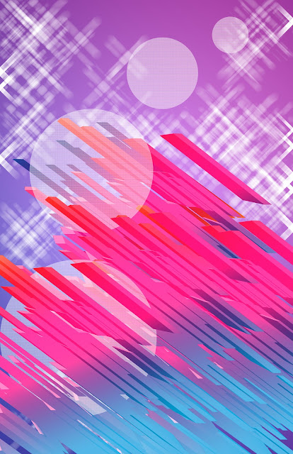 |
| This was a tutorial for a music poster (LINK), I took parts out that I didn't want and made the design more simple than the one in the tutorial which would allow me to then add more of my own ideas and make it different by possibly adding more hand made imagery. To achieve this I employed a multitude of techniques that I had never used before Like making my own brushes to create a pattern that I would then make 3D. Down to the more simple using basic shapes and changing the texture, pattern and fill. |
 |
| This tutorial was a lot simpler than the previous one. It showed me how to create a grungy distressed look but just adjusting the gradients and using the brush tool. |
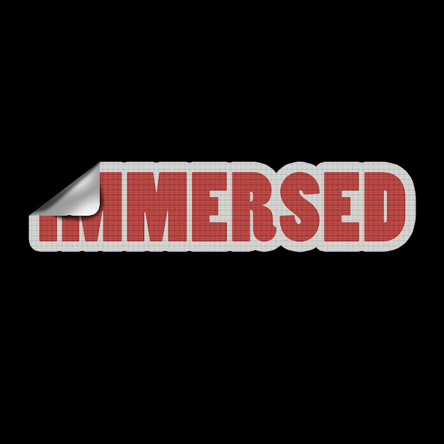 |
| This is my favorite text tutorial and it taught me how to create a sticker effect (LINK). The process its self is simple and quick because all I had to go was to make the out line bolder, cut off the top left hand corner and make it look like the back of a sticker pealing off. |


No comments:
Post a Comment