Once I had created my stencils and decided the order and the colours that I was going to use for the posters I began to apply them to A2 Card.
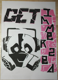 |
| As you can see this is a more refined version of the first attempt. I adjusted the positioning of the pictures and used another stencil that I created so that the section down the right hand side would come out clearer. The only thing that I am disappointed with is that it doesn't have the smokey effect on the emblem that the first did, but it is a lot clearer and there are no smudges. |
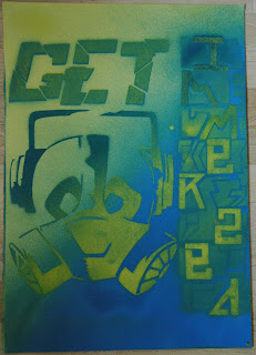 |
| I experimented further by mixing blue and yellow spray paint, layering it, letting it dry and then spraying over it again. This as caused and interesting effect on the right hand side where by the detailed part is faint and the lettering bold which makes it appear to pop out. The "GET" lettering also appears to be jumping out as the blue and the yellow have mixed to create green with small areas off blue emerging. |
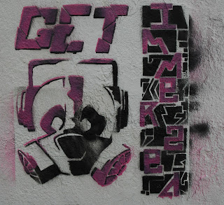 |
I decided to take my design further by stenciling onto a wall. I was particularly interested in what the textured background would add to the picture or not and it has. Again I used pink but using black as the base layer has made it darker and and more gritty. To give a weathered ware and tare effect I sprayed in diagonal lines over the stencils and deliberately missed areas a concentrated more on others. Spraying pink on black has created a 3D effect which was exaggerated more by off setting the the stencils.
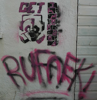
I decided to add some thing extra as this was the first time that I had spray painted onto a wall. Free hand, I sprayed the word "Ruffneck" changed to "RUFnEK", which is a common slang term used in jungle and reggae music, usually referring to a thuggish, rowdy individual. |
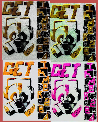 |
| Here are some further developments that I have created using Photoshop by adjusting the hue, saturation and colour. |
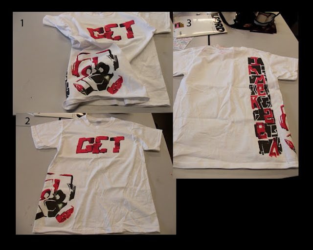 |
| To further develop and explore the possibilities of my final piece I decided to to put my work onto a t-shirt using heat transferable paper. Using Photoshop I divided the picture up into three different parts so that I could spread it over the t-shirt and make the most of the space. The paper was A4 size so transferring the design onto the back was challenging but the divide was barely noticeable. |
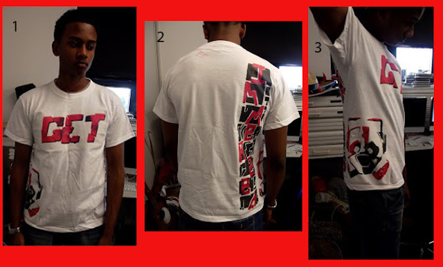 |
| Here is a student from my class modeling the t-shirt, showing each design that I put on it. |


No comments:
Post a Comment