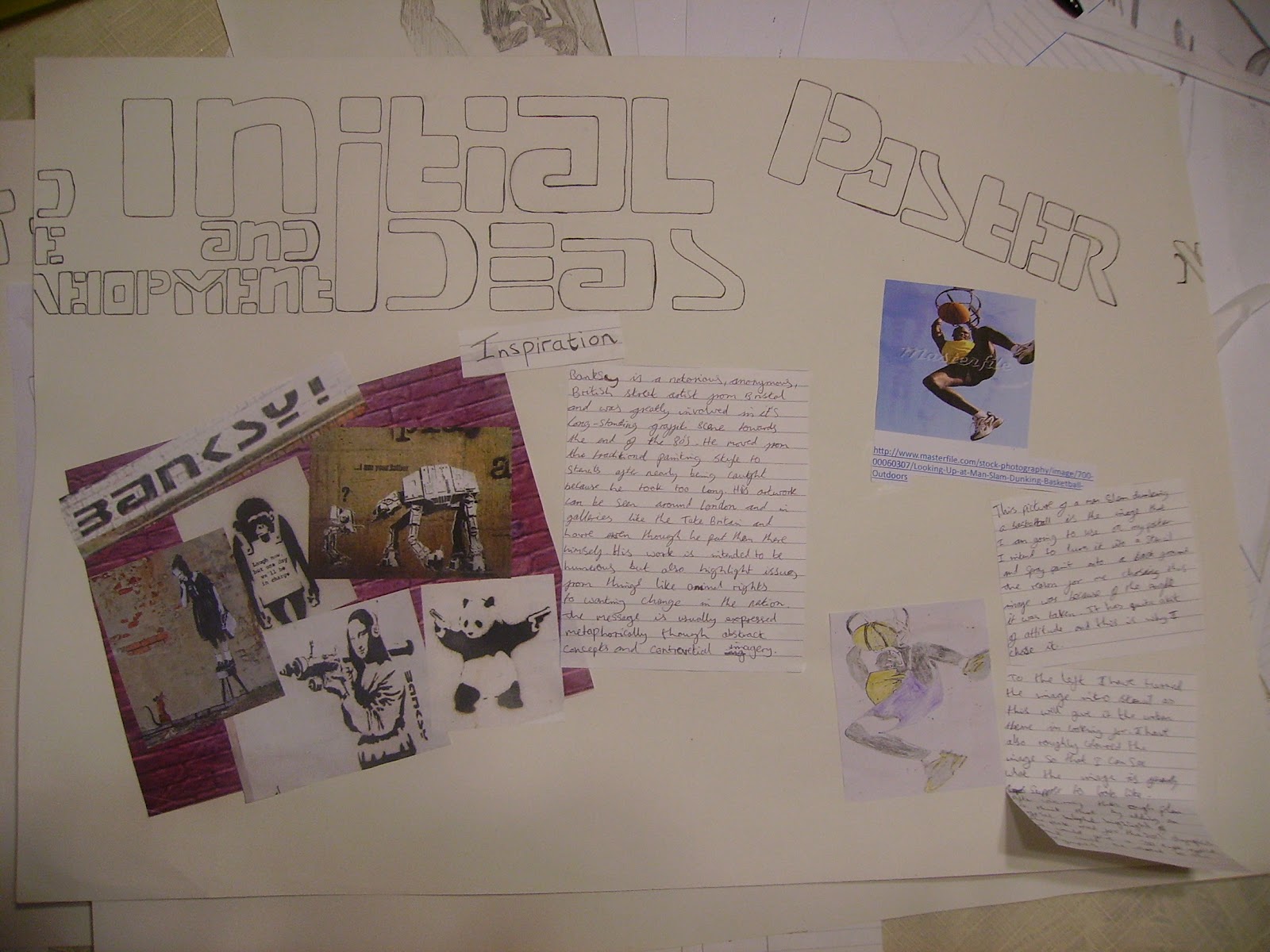
Showing posts with label Unit 2: EXAM UNIT:(groupe A). Show all posts

Sunday, 6 May 2012

Initial ideas and Development

On this page I talked about the artist who inspired me and the  style that I will be working in. I the poster that I will  be  creating and give a rough image of what one of the components of that poster will look like.

On this page I continue talking about the components that I will add to my poster. This included a possible back ground, the type style that I will use and the logo that I will create to go on all of my final outcomes. 

On this final page I show basic plans for t-shirt designs and ticket layouts and what will be included in them. 

Saturday, 5 May 2012

Instillations


This is an analysis of an art instillation done using office equipment that can be purchased from staples. I was done as a marketing exercise to advertise their products. I believe the message that they where trying to convey to the audience was that their products are useful and have many uses.


I viewed the video of the making of this instillation couple off times. The first was just to see what it was about and what happened in the video and then I re-watched the video to record the materials that they used and the techniques that they deployed in order to create it. The purpose of this piece  as I said before was to advertise staple is Australia. The artists have used products that the company sells to create a piece that the people of that country can relate to as well as show what they have on offer. The choice of city that they chose was good because not only does it have grand architectural structures but its also the commercial capital of Australia, the relevance being that they are a commercial business. One technique that they have used to increase the impact that the piece has on the audience is, that they have compacted the buildings together to give a felling of an immense city towering above everything  and as if it is all one body. The bright colours add to this by giving life to it, making it seem as though teeming with energy.


Olympic Advertising instillation.
Unfortunately this instillation was not completed because at the time I was the  only one working  on it. The initial idea that I had for this instillation was to have crowds of people around a running track at the top on the back board and then in the for ground a podium with people standing on it. To the left hand side I would have had the big Olympic torch that you can see. For the parts you can see I used relatively simple techniques. The people were the easiest as all I had to do was to fold paper, cut out a person and then unfold it. For the torch I rolled a piece of A2 coloured sugar paper into a cone and then I stuffed coloured tissue paper into the top and ripped bits of to make  flames, as if the torch was lit.

The advantages of using paper are, that it is cheap and easy to cut and make into the shape that you desire but, on the down side it is a very lengthy process and of course if you cut the wrong shape you have to get another piece of paper and do it again.

Friday, 4 May 2012

Paper Instillation artists Zim and Zou Analysis.


Zim and Zou are a french graphic design studio who who specialise in paper craft and creating pieces of artwork using paper. One of their recent projects is called "back to basics" and focuses on recreating vintage technologies using bright retro 80s colours. Their other projects include the "low gravity" project which is an advert for Windoo, a couch surfing and networking site which allows people to share information on hospitality services.


Back to basics
The picture to the left displays a range of outcomes that  they produced for their project. As yo can see it is all technology from the 70's and 80's era. Walk men, Polaroid cameras, floppy discs and early games consoles/games.

My first reaction to the piece was shocked when I found out that the items were made out of cut card which was shaped and put together and what was even more shocking was how each of them are very accurate in their sizes. The part that draws my attention is the selection of bright colours. The artists have used bright coloured card and layered it so that the items look more 3D and life like.


The sensory effect that this piece has on me is quite different to the one that may be expected and is contextually affected by modern culture. This is because in recent years, vintage art as been re-born and re-used in our every day lives. Vintage clothing and fashion is being purchased by the younger population, images and retro styles like the strait edges are and bright colours are being used in music videos and adverts and being merged with current styles to form new designs. This is evidently present in this modern era and this work can be related to an earlier part of the blog when I analysed some t-shirts that were made by a company called the joystick junkies. Even though they are a relatively new company, there is evidence that their brand was inspired by retro gaming; e.g use of the word joystick with the green console command type blocks as well as the colours on the deadmau5 t-shirt which are similar to the ones that are used on these items. A technique that they have used,, which is very common when presenting new technological products as well as fashion, is the use of a clean background with lighting shone onto it making it apear as if they have re invented the products. This being the case, when I see this I think of modern pop and electronic music. The 70s and 80s were at the beginning of  modern technology and was greatly influential on modern fashion; due the to the fact that since then we have made significant progress I think that modern artists and designers like Zim and Zou have decided to use this contrast of old and new because it gives this genre of digital pop culture a modern-urban twist.

This is one of the items that Zim and Zou have re created. It is a walk man which is what people used before modern day mp3's. The user would put a cassette tape into the player and then would play the music that was on it. One feature that draws my attention is how the artists have re created the actual magnetic tape that holds the music information. It appears that they have got a long strip of paper and winded it around another bit to form the reels. Another amazing feature is that you can open up the player and put the tape into it so it has moving parts.


Low Gravity
The low gravity project was an advertising campaign for a company called Windoo. I believe that the idea for the name low gravity comes form the action that the user of the sight would take which is surfing the web. The idea of floating around the internet and then homing in on the selected sight. This is relevant to the audience that the sight is intended for. The sites was made for back packers as a social networking site where they could rate the hostels or boarding facilities that they used and then share the information with other back packers so they can find a place stay and then see whether others recommend it, or suggest that they avoid it. As back packers also travel around looking for new things, surfing the  the globe, the designers intentions for the instillation are clear.


The logo is retro keeping with the theme of some of their newer  projects . It  uses isometric  patterns and pastel like colours which are very calm and gentle. This would make the audience and potential site users think that the site is friendly/user friendly and is there for the purpose of helping them. The colours are inviting and the design is likely to appeal to the younger population which are most likely to be back packers and using this site.
Again this instillation is representative of back packers for the obvious  reason that they give the  viewer the feeling that they are orientating the globe and the internet/ their site holds a  world of information. The paper planes represent playfulness and fun but also the idea of travel and taking planes to your destination. The use of the colour blue as the background makes the audience think of adventure into the unknown like the deep blue sea or soaring new heights into the sky.   

Thursday, 3 May 2012

Experimentation with rubbings and Lino printing.


These are some experimentation I have done using rubbing techniques and Lino printing.


The rubbing on the left was done using green oil pastel, i found at because the colour was light that when the pastel went over the edges of the template that I used it left segments of dark green making the image appear better. the one on the right was done using a 6H pencil. This was the best rubbing that I did because it is the clearest of all the rubbings.
On the left I tried using red oil pastel to see if the image would be as clear as when I used green, but the image is extremely hard to see. on the right is the template that i used to do the rubbings.


Here I have done some Lino prints. This was the first time that I have ever  done Lino printing and I found it quite challenging to cut out the image and to find an effective technique when digging it out. I chose to do a silhouette style image by digging out the image so that it would stay white when printed. To give the image a bit of depth I only cut out the outline of the arm and leg in the background so that when the image printed it would have colour on the inside and make them appear further away. If I was ever to do this agin in the future I would improve it by using a lighter piece of Lino so that I could see the image that I drew onto it better or use a white pencil to mark the picture onto the Lino.  I would take more caution when digging out the image and experiment with mixture of colours. I could also try overlapping the images to make them appear to be in a kind of 3D order, as if going into the page. I would also try adding more detail to the initial  design.


The characteristics of Lino and printing.

Smooth, durable, bendy, tough, flat, hard, thin, reinforced, you can cut it, carve it and make 2D prints with it.

Advantages of Lino Printing.

  • Carve it
  • Print it
  • Emboss
  • Rubbings
  • Reduction printing
  • Tough/ Sturdy
  • Print onto different surfaces
  • Easy to cut

Disadvantages of Lino Printing.

  • mistakes are irreversible
  • not 3D
  • you have to work hard to get texture
  • hard to cut
  • limited colour
  • application rollers
  • hard to clean, hard to get of hands
  • barrier cream for hands
  • white spirit- fumes (health and safety issues)
  • long time to dry
  • time consuming

Wednesday, 2 May 2012

Athlete Sketches

Here I have sketched some athletes competing in their events to aid with creating my final outcome. By sketching a range of athletes from different professions I will open my eyes to new ways that I can compose them.

The image above on the left is of a russian gymnast twirling a baton with ribbon on the end. For this I decided to just draw the outline of the image because I liked the way that she contorted her body and was very poised and elegant in her movements. So by drawing the outline I would be able to see this better. The pose that the athlete makes in the images that I will use is important because an exaggerated one will add more depth to the picture and make it seem more extreme and intense. On the right is Rafael Nadal, a Spanish tennis player who I drew in the middle of a celebration. As you can see the facial expressions show the excitement that the athlete is feeling about winning. Facial expressions are important to human communication because slight changes can represent a completely different emotion as well as change the moods of other people.
Russian Gymnast.
Rafael Nadal.


The picture at the top is of a swimmer competing at the olympics and appears to be doing breast stroke. in this picture the difficult part was trying to draw the water. so what I did was shade the area that the water had taken up and then used a rubber to erase the shape of the ripples and then smudged the area with my fingers to give ares of light and dark. The second picture is of Ussain bolt. This was drawn from a picture of him when he crossed the 100m finnish line. For this picture I concentrated on the muscles using areas of light and dark to make them look 3D. I also used a rubber at the top so it appeared that light was shining on it.

Swimmer doing breast stroke.

Usain Bolt.

Tuesday, 1 May 2012

Initial work and developments

These are some of the initial activities that I under took in order to give my self a broad range of ideas and to develop and get me started.


Firsts of all I got some images of previous Olympic logos (site). I got theses logos so that I could get ideas from existing logos and help with the developments of my own logo. they are from the Tokyo, Roman, Athens, Beijing and the Sydney Olympic games.
Above are some pictures of athletes competing (Javelin, Basketball, Swimming,  Bmx, Usain Bolt) .
One of the outcomes that I will create will be a poster and this will feature a picture in the middle of competing in their sport.


These are some initial developments of logos that I have done using the pictures of athletes competing as inspiration. I have explored a few techniques and designs that i should consider when creating my final logo.

The first is for the Javelin event. The design was modeled on one of the icons that are used to represent the events. I drew the image and then I wrote the name of the event next to it with the Olympic logo underneath. I like this because it is simple and doesn't distract from the purpose however it is quite plain. 

The second is for the basketball event. For this I drew a simplified image of the picture I found above. I used the Olympic colours and then drew rings around the hoop making it look like the official logo. However I think that this is a bit complicated and over the top. It should be more simple.  

For the swimming event logo I have drawn the image of the swimmer in the pictures that I gathered. For this I decided to change the image so that the swimmer looks like the union flag with a human form.  I thought that this would be a good idea as the 2012 Olympics are being held in London which is in the U.K.  In creating this logo I have noticed that using fewer colours and keeping it simple make the image bolder and easier to remember.

Next I tried to develop a logo which could invoke the touch senescence. To do this I raised certain parts of the logo by using black paper and sticking it over prominent features like the tires and the helmet. This also adds depth to the image. As the subject is in mid air, the black as well as the raised surface make it almost appear to pop out. I also used a simple graffiti type text to write the  name of the of the event to give an urban feel.

The last image is for the 100 meter sprint. The colours of the Olympic logo flare out behind the runner to represent speed and they are joined to the logo as if the spirit of the Olympics is infused into the competitor. I used the name off the event and the location that it will be held to form the finish line of the event. Of all of the logos this is my favorite because it it embodies the essence of the what it is to be an Olympic competitor.


This sketch was a still life
done of  a sports equipment arrangement.


This is a picture of the  sporting equipment that I drew.


This is a sketch of a cricket helmet.
This is the helmet that I drew.


For this picture I did one sketched and one continuous line drawing of cycling shoes.

This is a picture of the bike shoes that i drew except the composition is different.

Tuesday, 7 February 2012

Analysis of chosen outcomes.

Poster.

1948 london olympic poster:This is a typical poster in the 1940s style and is advertising the London olympics that were held that year. it is simple in design and you can compare it to the WW2 propaganda of the time as they all used the same style. A similarity being that they glorify the object of their advertisement. The use of a greek statue gives the idea of gods and legendary competing in a grand event which makes the audience fell as if they'd be going to such an event. Of course they have included a London landmark which is big ben. The title at the top is black and bold so there is no distraction form the purpose and the intent is obvious. The date is included so that  possible spectators know when the event will be held. the colours are soft and pastil like give an ancient feel. The composition of the olympic logo with the images gives me the idea of watching the discus, a traditional olympic event with this statuesque, well renowned athlete, with crows cheering and as you flashing though the grand parts of London. 

Olympic Munich posters site: This poster is advertising the rowing event at the 1972 olympics in munich. I chose this image because it has a stencil like effect to it with the different layers of colour and that is the style that I am going to use for my final piece. The bright colours give a feeling of energy surging through the athletes as they compete to win. Of course they also draw a lot attention to it making it successful advertisement. The bright colours can be linked to the time with the idea of revolution and freedom. Germany are likely to have gone for this as to change peoples perception of the country after the events of previous decades to show they are free thinking and share the same ideals as the rest of the world. This is a highly memorable piece because of the bright colours and the simple image that takes up the whole poster.

Olympic riot stencil: The artist of this piece is unknown but it was created in light of recent events and I chose this picture because it uses a stencil style but also because the image is negative as it displays a rioter stealing one of the olympic rings. I wanted this because the poster that i want to create will show a positive side to london and the olympics, by giving an urban feel that is representative of the majority and not the minority. Of course the image has a comic element to it which can be related to the work of Banksy, a street artist that uses this style of art to create controversal pieces with a greater meaning than the artwork it's self. The typical way of making a stencil like this is to use Bright colours for the focal points and to use bland colours like grey and black for the rest of the image or parts that you don't want to highlight. For example with this piece the rioter is a black stencil because the artist wants to highlight the action of him stealing the olympic ring. 

Beijing olympic Logo: The Beijing olympic logo displays many parts of Chinese culture and customs. for example the colour red is seen to be lucky in China and id the colour of their flag. There is a dancing person on the front which gives the idea of celebration and the Chinese festivals which are big and grand. The Style of the dancing man is the same as the one that is used for Chinese writing and stone carvings. The title of Beijing 2012 is written in Chinese calligraphy so the composition of the poster is very typical of the country. The composition overall is simple and modest which is similar to the persona of the Chinese, as culturally they are not as wild or boastful as western nations like america or even Britain. The poster in my opinion is good but it lacks an enthusiastic element because it is modest and isn't wild or particularly bright and extravagant a the London 2012 poster.


London 2012 Olympic Logo: The London 2012 olympic poster is bright, extravagant and very abstract. The logo spells out 2012 which is the date that the event will be held and has London written in the first number two and the olympic rings in the zero which are both in white making them stand out. At first I thought that the logo took the shape of the log was the british isles as the two numbers on the right hand side appear to look like scotland, England and wales. The colours that are used are bright and stand out
and the yellow behind the pink almost makes the image look 3D. The image is very modern and is more for the internet generation compared to the 1948 which would appeal to the older generation or people of that time. This logo to me represents modern ideas of freedom as you are highly likely to find a logo like this fifty years ago as its too outspoken. Personally I don't like this logo because it seems too commercial and doesn't give me a feeling of pride or want to go and watch the olympic games.


Ticket.


London 2012 olympic ticket: On the top left of the picture is the London 2012 olympic ticket which displays mini logos of stick people carrying out the events. The design is simple and contains all the information that the ticket holder requires to get in an to find their seat. The ticket also displays the name of the event that the ticket will get you into. It also has a colourful image on the left hand side that looks like wind blowing and is in rich colours that suggests to the owner they have an invitation to a grand event.

Beijing olympic ticket: The beijing ticket uses the same principles as the London ticket but in addition displays an image of the birds nest stadium which was their main stadium.

Deadmau5 ticket: I selected this ticket because it was from a Deadmau5 concert. The reason that I selected this is because of the unique design. The ticket has been cut out so that it takes he shape of the artists mouse trademark helmet. I also selected the ticket because the organisers of these events know how to draw in and excite the crowds of people and one of the ways they do this other that through the music, is through their advertising and my making the event a memorable experience. This design also make the ticket a piece of memorabilia and its small touches like this that make events like this very popular among the youth of today and the community of people that go to these events. These are the techniques that I will use and try to include when designing and making my outcomes.

Green day ticket: Again the Greenday ticket uses modern designs to capture their audience and to make the event more exciting.

TShirts.


London Olympic Tshirt: Here is an example of an olympic t-shirt which displays small logos reflecting the events in the olympics it is modern in design and has a very electronic, disco feel to it. It reminds me of looking at the home screen of an ipod touch or iphone with all the apps in a gridded formation.

Basketball Graffiti Tshirt: The event that I will be supporting for my final outcome will be the basketball event and I would like to use a modern graffiti style for my designs so there for I obtained this picture in order to get an incite to what else has already be done. The design was achieved by using a stencil technique and bright pink to make the image stand out and almost appear 3D.

Joystick Junkies Pixels Logo: This t shirt was made by a modern fashion company called the joystick junkies and uses green pixels to spell out their logo. Because they use quite retro concepts to create their designs like here for example the letters are being formed as if was during a game of Tetris and being typed on an old computer. Again I selected this t shirt to aid in the creation of my t shirt image because the design is modern and new age so it will appeal to the younger generation which is what I aim for my designs and outcomes to do.


Deadmau5 1up Tshirt: I was attracted to this t shirt because of the bright colours and it is this reason that I have included it into my analysis. The outcomes that I create will have to incorporate bright colours if I want to attract a younger audience. The t shirt is advertising the music artist and one of his festivals so on the whole I think that as a form of advertisement it is successful as well as a piece of memorabilia because it clearly displays the the theme of the event but isn't to loud and overpowering as some forms of advertising can be.

Explanation of breif choice

I have chosen to do the 'Branding brief'

Why have you selected this brief?

I have selected this brief because because it gives me the chance to use techniques and styles that I enjoy using but also that i have used in the past. The task is to create a logo, poster and other promotional items for an olympic event. I have done t-shirt printing before and have created large pieces of artwork in the past and so I can use past knowledge to my advantage I have also created logos in past projects so this will help me as well. I also think that this is the best decision for me because in the last project that I did i had to create packaging, and in the previous typography so it will give me a chance to do something different.

What are you planning to look at for primary/ secondary research?

I am planning to look at past olympic posters, street artwork because I want to give an urban feel, olympic sports that would work well with an urban theme, books on street artwork but also street artwork in and around London. I will be looking at artists like Banksy and designers of past olympic posters.

What artists are you planning on looking at for?

I will be looking at artists but also websites and books that help with logo design and are relevant to the style that I will use. Street artists like Banksy will play a big part in my design and development of the imagery I create but I will use websites like design modo and logo design works to see existing logos and what makes them effective.

What materials/techniques would you like to experiment with? 


I would like to experiment with spray paint, stencils and possibly printing if i decide to make t-Shirts. Materials will be card and different paper to find the best one to use in the making of my stencils.


Which outcomes are you planning to make?


I am planning to make a logo, a poster and one or some t-shirts as this will depend on wether or not I can create them in the time allocated to the exam.