My brief for this project was to create advertising and promotion for a festival that I had made up that was related to the record company I created in the previous project, "Red Lion". So to produce outcomes like wristbands, posters, t shirts and flyers. The main target audience was young adults aged 18 to 25 but this would also include people that where interested in the festival and the music that it supports. I came up with ideas for this by thinking about all of the events that are associated with music and what would allow me to produce the best type of outcome as well as give me room to explore possible different outcomes and the festival idea was the best.
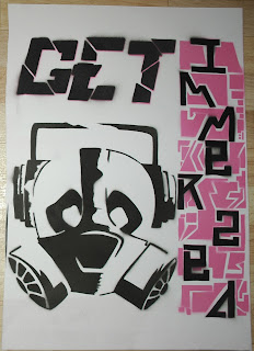
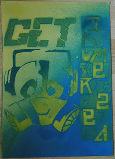
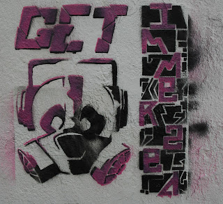
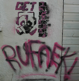
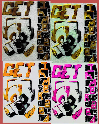
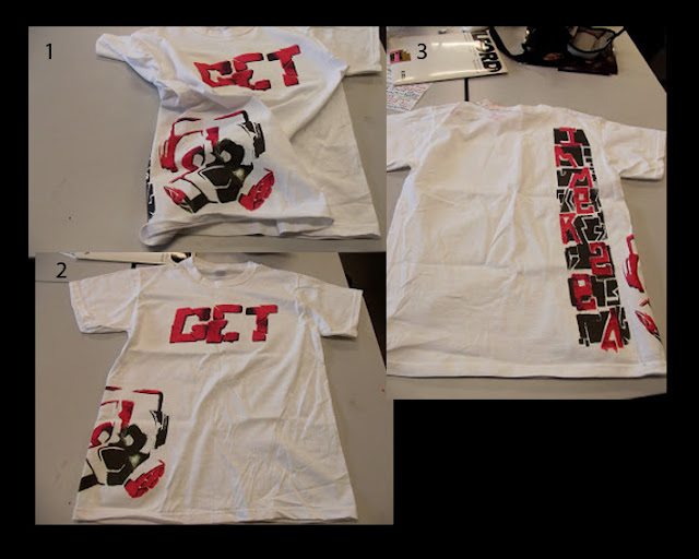
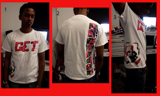
Initially I started looking at the products that festivals and music companies related to the music genres produce, sell and use to advertise their events or business. I found a lot of the posters that are usually used to advertise the events are very computer generated and have a very digital feel to them, but because my festival is suppose to be about the bass music culture even though the music is electronically produced, the music has a very earthy feel to it because of the very deep warm feel that it has. Using a lot of computer generated imagery draws away form that vibe so I wanted to use more hand made techniques but as it is electronic music incorporate a digital/ modern element into it. After making that decision I started to look for festival artwork that had been created by festival goers, paintings on walls that expressed visually the music and the atmosphere of the festival.. These images re usually quite abstract and include anthropomorphism. I believe this is because they are trying to to say that when you listen to the music you become more in touch with your primal self , you lose all desire for material possessions and the need to impress others or care what they think about you. It's just you and the music. I found some work by one artist in particular called Mr Penfold, used simple designs mostly shapes and block colours put create a uniquely stylised cartoony image but in a way which can still be appreciated by a mature audience. This style relates well to the music which is minimalistic in terms of what he artist puts together when composing the music. Other artists that I looked at where keith harding and Blek Le Rat. Keith Haring being on the for front in the creation o the street art scene. I looked at and explored the work of Keith Haring and the deeper messages that his work contains to see f I myself could give a more deeper political meaning to my work. Blek Le Rat was the inspiration behind the style o medium that i used to create my piece. I wanted to use the stencilling technique as this would give the hand made feel I wanted but also an urban minimalistic feel. Blek Le Rat was a major inspiration for he British street artist Banksy. In previous projects I have analysed the works of Banksy in the past but this time I wanted to go back to the roots of where the style came form in the same way that some of the music of the festival is about relating with your origins. Blek Le rat is famous for his black rat which in effect is like his tag, but what I like most is the how the colours and the choice of surface he applies his work to look rundown and deprived but also earthy and full of life. This makes me think of Cuba in terms of the fact that when you look at the country, the towns and cities, it appears to have been paused form the 1950's on-wards It has remained in that state while the rest of the world has been left to grow and develop because of the rules of communism that prevented them form doing anything and as such it is starting to crumble and fall apart, yet underneath all of that the music that they produce is full of life and the people are very into carnivals and enjoy partying.So to me Blek Le Rat's work brings life and growth to places that appear to be suppressing it. With this in mind I began creating my piece by doing sketches relating to the artists that I researched and the type of artwork, themes and vibe that I wanted to involve in the piece. For the creation of the emblem I wanted to incorporate the panda. The panda is quite a big and lazy animal and in comparison to the music; dubstep, dub, reggae which all have slow deep baselines, the panda is the animal represents this the best. I used the anthropomorphism by putting headphones on it and so allows people to relate to it. To give an urban/ ghetto feel to this I put a gas mask on the face so that the image has a "fallout", back to square one look, but also because the mouthpiece of the gas mask look like the mouth and nose of the panda. When you are trying to send out a message, using lost of colours can distract from the purpose so I decided to use two, black and pink as his would make one of the colours look like they where popping out depending on how I arranged them. In the case of the lettering down the side the black stand out more on the paper version but on the spray painted version the pink on the emblem stands out more. As an experiment I tried using yellow and blue as they are primary colours and this allowed me to blend them at points to make green as well and was a good contrast from the black and pink. Spray painting onto the wall brought the image closer to the effect that I was trying to go for, the uneven surface gives more of a ware and tare feel because some areas where raised more than others and so they would have got more paint on them than the others. For further experimentation I took pictures of the wall piece and put it into Photoshop. This allowed me to play around with the hue, saturation, the contrast and the colours of the images as well as warp one of them. I selected one of the edited images and chopped it up separating the different parts and put them onto a template and designed a t shit. I then printed onto heat transfer paper and placed the designers one by one onto a plain white t shirt using a heat press.
I think that the best part of my outcome was the wall piece because of the different effects that I managed to create. The parts that worked the best where the emblem and the get lettering because of the 3D effect that I managed to create. I also managed to cut out the stencils quite accurately and I believe I have greatly improved my stencil skills. I could improve my outcome by adding more to the pieces and fill the spaces. I could have planned better the imagery that I used so that every thing I created linked together better. I enjoyed the project as it allowed me to explore something that I have a great interest in through my art however in the future I would like to explore other styles of street art as well as forms of mixed media and incorporate more texture into my work.
I think that the best part of my outcome was the wall piece because of the different effects that I managed to create. The parts that worked the best where the emblem and the get lettering because of the 3D effect that I managed to create. I also managed to cut out the stencils quite accurately and I believe I have greatly improved my stencil skills. I could improve my outcome by adding more to the pieces and fill the spaces. I could have planned better the imagery that I used so that every thing I created linked together better. I enjoyed the project as it allowed me to explore something that I have a great interest in through my art however in the future I would like to explore other styles of street art as well as forms of mixed media and incorporate more texture into my work.
